Sourceability: UX Designer
Sourcengine’s Bill of Materials Tool: a comparison and quoting engine for electronic components
Digitalizing the electronic components supply chain via e-commerce. Designed from the ground up, making $$$. Check it out here.
For a more detailed case study reach out to me. Below is a general overview.

High-fidelity mockup of Q2 2021 production release
Design Process
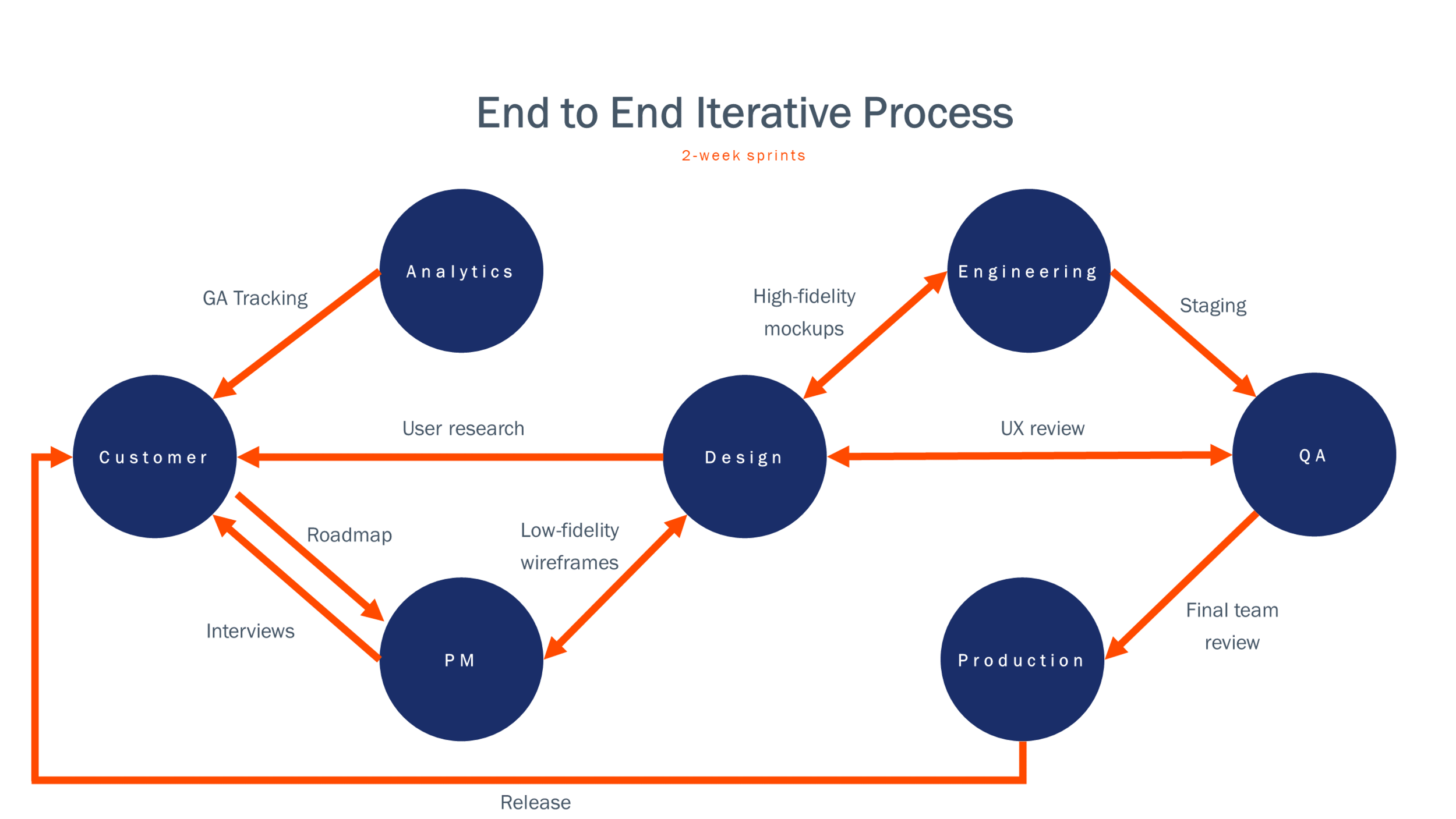
Constantly collaborating across design, product management, engineering, QA, and analytics. Admittedly we need to do a better job incorporating user testing in our process. Currently user research involves customer interviews, competitive analysis, and refining our personas.
Here is a small glimpse of just one feature of the hundreds of rounds of iterations on the continuously evolving and work in progress tool.
Quoting Criteria & Quoting Results section
First design iterations


Our professional purchaser user persona needed a visual way to both set quoting criteria for their uploaded list of parts and to filter those quoting results. Different types of charts were versioned based on competitive analysis, user familiarity, and quickness of assessing visual information. Also interaction states on each type of chart were prototyped to understand ease of interaction. Based on customer feedback, users were most used to waffle charts. However, they also mentioned how slow and clunky the interaction was.
Donut charts were selected because of their fast scanning of data categories and comparability of proportional values. Additionally, center text can be added to display information such as current selection or total number of parts.
Further design iterations


At the same time, users needed to know if the parts they uploaded matched with what we have in our catalog. Having two color based systems, Parts Match Status and Quoting/Sourcing Results, ended up clashing and overwhelming the users. Working extensively with product management and the engineering team, the matching of parts got split into a tabbed approach in the data table. Partial matches received their own column for the user to resolve by finding other similar parts we have in our catalog.
With one color and donut chart system, the top filter section was able to be consolidated and focused on our quoted offers of the users’ parts. Hence why it was renamed from “Sourcing” to “Quoting”. Adding checkboxes gave users another avenue of filter control and using distinct colors made distinguishing between categories faster and easier.
Final design iteration


There was still a disconnect between the top filtering controls section and the bottom data which contains the actual filtered quoting results. This gap was bridged by collaborating with marketing and visual designers to create iconography. Individualized icons for “Quoted”, “Review Adjusted Qty”, and “Not Quoted” were added to both the top Quoting Results section and in the new Quoting status column in the data table below.
Furthermore the Total Quoted price, which contains our overall BOM level pricing based on the best offers, was moved from the very top of the tool below into the Quoting Results section. Informed by tracking analytics, “Export” and “Add all to cart” buttons were also brought down closer to the data table to better align and associate information and actions based on checkout.
As Sourcengine’s BOM tool is constantly updating, so is the design team’s process. Currently working to get more lower-fidelity wireframes into the process to discuss solutions with engineering earlier as well as to incorporate user testing with customers.
Additionally, the design team is focused on making sure Sourcengine’s user experience is as holistic as possible on both product and systemwide levels. To address this, a renewed focus is on building and maintaining a robust design system.
While nothing in design is ever truly “final”, I’m pretty dang proud of what we’ve built and designed…revenue exceeding expectation’s a nice bonus too.